TheNextGeneration

  • Subscribe to our RSS feed.
  • Twitter
  • StumbleUpon
  • Reddit
  • Facebook
  • Digg
Showing posts with label albedo flip. Show all posts

Tuesday, June 18, 2013

Joe Romm: Exceptional 2012 Greenland Ice Melt Caused by Jet Stream Changes that May Be Driven by Global Warming

Posted on 11:40 AM by Unknown
by Joe Romm, Climate Progress, June 17, 2013

New research finds that “unusual changes in atmospheric jet stream circulation caused the exceptional surface melt of the Greenland Ice Sheet (GrIS) in summer 2012.”

Prof. Jennifer Francis tells me these changes are consistent with those caused by warming-driven “Arctic Amplification.” And that means GrIS may melt faster than climate models have projected.
Extent of surface melt over Greenland’s ice sheet on July 8, 2012 (left) and July 12, 2012. In just a few days, the melting had dramatically accelerated and an estimated 97% of the ice sheet's surface had thawed. Credit: NASA.
Back in May, a study found that by 2025, there is a “50–50 chance” of this unprecedented ice melt happening annually simply based on the continued rapid warming of GrIS.
This new study, “Atmospheric and oceanic climate forcing of the exceptional Greenland ice sheet surface melt in summer 2012,” suggests this kind of melt may become commonplace even sooner.
As the news release explains, an international team used a computer model and satellite data “to confirm a record surface melting of the GrIS for at least the last 50 years – when on 11 July 2012, more than 90% of the ice-sheet surface melted. This far exceeded the previous surface melt extent record of 52% in 2010.” Weather station data “showed that several new high Greenland temperature records were set in summer 2012.”
The research “clearly demonstrates that the record surface melting of the GrIS was mainly caused by highly unusual atmospheric circulation and jet stream changes, which were also responsible for last summer’s unusually wet weather in England.”
What were these changes? Professor Edward Hanna from the University of Sheffield’s Department of Geography explains:
“The GrIS is a highly sensitive indicator of regional and global climate change, and has been undergoing rapid warming and mass loss during the last 5–20 years. Much attention has been given to the NASA announcement of record surface melting of the GrIS in mid-July 2012. This event was unprecedented in the satellite record of observations dating back to the 1970s and probably unlikely to have occurred previously for well over a century.
“Our research found that a ‘heat dome’ of warm southerly winds over the ice sheet led to widespread surface melting. These jet stream changes over Greenland do not seem to be well captured in the latest Intergovernmental Panel on Climate Change (IPCC) computer model predictions of climate change, and this may indicate a deficiency in these models. According to our current understanding, the unusual atmospheric circulation and consequent warm conditions of summer 2012 do not appear to be climatically representative of future ‘average’ summers predicted later this century.
“Taken together, our present results strongly suggest that the main forcing of the extreme GrIS surface melt in July 2012 was atmospheric, linked with changes in the summer North Atlantic Oscillation (NAO), Greenland Blocking Index (GBI, a high pressure system centred over Greenland) and polar jet stream which favoured southerly warm air advection along the western coast.
“The next 5–10 years will reveal whether or not 2012 was a rare event resulting from the natural variability of the NAO or part of an emerging pattern of new extreme high melt years. Because such atmospheric, and resulting GrIS surface climate, changes are not well projected by the current generation of global climate models, it is currently very hard to predict future changes in Greenland climate. Yet it is crucial to understand such changes much better if we are to have any hope of reliably predicting future changes in GrIS mass balance, which is likely to be a dominant contributor to global sea-level change over the next 100–1,000 years.”
These changes in the jet stream and blocking patterns sounded quite similar to the findings of Francis, NOAA, and others. While the news release says, “The analysis shows that ocean temperatures and Arctic sea-ice cover were relatively unimportant factors in causing the extra Greenland melt,” I asked Dr. Francis if in fact these findings were consistent with her work.
She replied:
Hanna’s findings seem very consistent with the research I’ve been involved with, particularly our observations of an increasing tendency for ridging in the north Atlantic during summer. While I agree with him that sea ice loss per se may not be the primary driver of this behavior, I think it’s likely that Arctic Amplification (AA) IS playing an important role.
Sea ice loss is only one factor driving AA. In spring and summer, the AA appears to be caused mainly by 2 other factors: (1) the decline of snow cover on high-latitude land areas creates an albedo feedback similar to sea ice but is instead involves the earlier drying and heating of the soil under the snow, which promotes an earlier warm season on the continents and contributes to enhanced Arctic warming, and (2) increasing water vapor transport into the Arctic.
As you know, water vapor is a powerful greenhouse gas, it releases heat into the atmosphere when it condenses into clouds, and extra water vapor promotes additional clouds, which are also effective trappers of heat below them. The water vapor effect may be the most important for the summer ridging over Greenland, as it causes warming through a deeper layer of the atmosphere than the snow/ice effects (see Alexeev et al., Climate Dynamics, 2005; Porter et al., JGR, 2012), and thus has a more direct impact on weakening the poleward temperature gradient and consequently the jet-stream zonal winds. There was also a recent study by Von Walden and coworkers showing that cirrus clouds also caused additional surface warming over Greenland last summer, and these are just the type of clouds you’d expect to see under an upper-level ridge of high pressure.
If this ridging pattern continues to be as persistent as it has been since 2007 (see Hanna et al., 2012), then it could be that the climate models are underestimating the amount of surface melt from the Greenland ice sheet.
It would seem that warming-driven non-linear effects are starting to dominate Greenland ice melt. It may be time to redo projections of sea level rise once again.
Related Posts
  • Science Stunner: Greenland Ice Melt Up Nearly Five-Fold Since Mid-1990s
  • JPL bombshell: Polar ice sheet mass loss is speeding up, on pace for 1 foot sea level rise by 2050
  • Greenland Ice Sheet Melt Nearing Critical ‘Tipping Point’
  • Greenland Ice Sheet “Could Undergo a Self-Amplifying Cycle of Melting and Warming … Difficult to Halt,” Scientists Find
http://thinkprogress.org/climate/2013/06/17/2169321/exceptional-2012-greenland-ice-melt-caused-by-jet-stream-changes-that-may-be-driven-by-global-warming/
Read More
Posted in albedo flip, Arctic amplification, Greenland ice melt, GrIS, heat dome, Jennifer Francis, Joseph Romm, Positive feedbacks, snow cover | No comments

Thursday, June 13, 2013

John Abraham: Why Greenland's darkening ice has become a hot topic in climate science

Posted on 7:53 PM by Unknown
Darkening causes the snow to absorb more sunlight which in turn increases melting 
 
Scientist Jason Box during an expedition in Greenland
Climate scientist Jason Box during an expedition in Greenland in July 2008. Photograph: Byrd Polar Research Center 
 
by John Abraham, Climate Consensus: the 97%, The Guardian, June 12, 2013

Last July, a record melting occurred on the Greenland ice sheet. Even in some of the highest and coldest areas, field parties observed rainfall with air temperatures several degrees above the freezing point. A month before, it was as though Greenland expert Jason Box had a crystal ball; he predicted this complete surface melting in a scientific publication. Box's research then got broader public visibility after climate activist and writer Bill McKibben covered it in Rolling Stone magazine.

The basic premise of Box's study was that observations reveal a progressive darkening of Greenland ice. Darkening causes the white snow surface to absorb more sunlight which in turn increases melting. Given that this process is likely to continue, the impact on Greenland melt, and subsequent sea level rise, will be profound.


There are several mechanisms that are known to darken arctic ice, including desert dust, pollen, soot from natural forest fires, and human biomass burning for land clearing and domestic use. Industrial, shipping, and aircraft pollution also play a role. Some of these effects are increasing. As climate change accelerates, more areas are being burned by wildfire each year. Box wondered how much increasing wildfires with resulting soot landing on the northern ice might amplify what scientists call a "positive feedback" (a self-reinforcing cycle) increasing Greenland melting. The cycle starts with initial warming, leading to more fires, more soot, and in turn more warming and more melt. The feedback is important, particularly in polar regions where observed warming is twice the rate of more southerly locations around the globe. Box calculates this effect has doubled Greenland surface melting since year 2000.

The topic has become hot among ice experts as new observations of ice melt continue to outstrip projections from just a few years ago. Arctic sea ice, another key measure of global heating, is now 60 years ahead of worst-case projections from the last report by the Intergovernmental Panel on Climate Change in 2007. Arctic snow cover on land has also been declining more rapidly than projected, even faster than sea ice. While mass loss of the enormous Greenland sheet is difficult to measure, satellite data indicate it has doubled in the last decade. If this acceleration continues, sea level rise could be even higher this century than the 1 or 2 meters that mainstream scientists now project – possibly much higher. Despite a recent study that projected Greenland outflow glaciers to slow, surface melting has increased faster than ice flow. The albedo feedback is a critical piece of physics that enables surface melting to continue dominating the loss.

To test his hypothesis, Box has assembled a team of scientists and communicators to collect and analyze samples from key locations on the ice sheet, and report those results directly to the public. The plan is to arrive in Greenland in late June, just as the peak melting season and fire season coincide. Box will be joined by Bill McKibben, who will be covering the research for Rolling Stone, and videographer Peter Sinclair, whose series of climate change videos on YouTube has gained high praise from climate scientists.

The scientific team includes Sara McKenzie Skiles, a researcher at UCLA and the NASA Jet Propulsion Laboratory, and Marek Stibal, a biogeochemist at the Geological Survey of Denmark and Greenland. Dr Stibal will be looking at yet another potential source of darkening, the activity of microorganisms that produce their own darkening pigments, which may be increasing due to atmospheric warming and fertilization by pollutants.

While government funding contracted, Box decided to push forward with a new approach, financing the research as a "citizen science" initiative, funded by internet crowd sourcing. His project is aptly named DARK SNOW and financial support is being collected online.

It is exciting to watch emerging science collide with novel scientific fundraising initiatives. It is possible that this emergence will grow in the coming years as scientific projects grow in cost and complexity, while more traditional funding sources diminish. The costs of funding projects like DARK SNOW are miniscule compared to the costs we endure from climate-change-related weather disasters. The penny-wise pound-foolish attitude we've taken toward science funding is a complicated issue that I'll deal with in a future post.

http://www.guardian.co.uk/environment/climate-consensus-97-per-cent/2013/jun/12/greenland-darkening-ice-climate-science
Read More
Posted in Aerosols, albedo flip, Bill McKibben, Black carbon, Greenland ice melt, Jason Box, John Abraham, Peter Sinclair, Soot | No comments

Saturday, May 25, 2013

Chris Reynolds: Acceleration of summer Arctic sea ice loss

Posted on 4:39 PM by Unknown

Summer Acceleration

by Chris Reynolds, Dosbat, May 23, 2013

I have recently outlined the changes in the Cryosphere Today Area index (CT Area), using anomalies to examine the changes from the long-term-average seasonal cycle. I've shown the changes in the CT Area anomalies (link), the autumn response to increasing open water in the summer season (link), and the recent June anomaly crashes (link). I have also covered research showing the majority of surface-based Arctic Amplification is a response to summer ice loss (link), and that this amplification is probably being understated by the GISS dataset (link). However, I have not addressed a substantial issue -- that of the summer acceleration loss of area when compared to the loss of winter area.

The ice edges within the Arctic at minimum and outside the Arctic at maximum are set by different regions at opposing times in the seasonal cycle; until recently the recession of the ice edge had been proceeding at very nearly the same rate, leading to only a small increase in annual range. 2007 changed that, as can be seen from Cryosphere Today (link), where 2007 is seen to usher in a steep increase in the annual range.


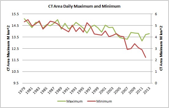
In the graphic to the left, the green trace (annual daily maximum) is read on the left-hand axis, and the red trace (annual daily minimum) is read on the right-hand axis. However, both axes are 6M km^2 across, and are merely offset to match the earlier period. From this it can be seen that, for much of the period, both maximum and minimum follow each other relatively closely. In other words, whatever caused the reduction in area in March and September, it seemed to be applied equally to regions geographically remote and removed in time by 6 months. The most reasonable cause of this, backed up by other reasoning, is that Anthropogenic Global Warming has been causing the loss; to argue for separate processes makes things get rather complicated very quickly. This period of decline of sea ice also covers a period of substantial volume loss; September lost 7,800 cubic kilometres of sea ice from 1979 to 2006.

However, since the 1990s, and to a far more marked degree since 2007, the two plots have diverged markedly. This is the Summer Acceleration.


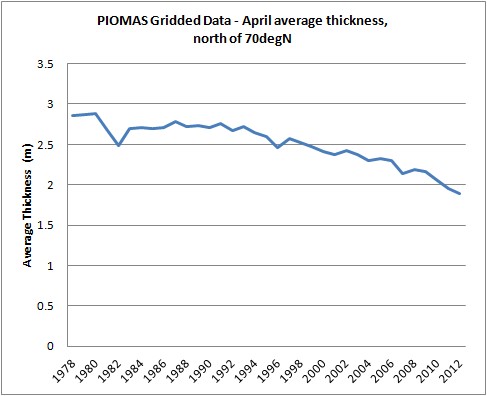
Using the data I've previously calculated, I have broken down the April PIOMAS volume into the volume contribution from grid box cells with an effective thickness of less than 2-m thick, and the volume contribution from those cells whose effective thickness is more than 2-m thick. April is chosen as the peak volume month, a 2-m-thick demarcation is chosen because ice thinner than 2 m thick is typically thermodynamically-grown first-year ice and that over 2 m thick is typically mechanically-thickened multi-year ice. The graph covers 1978 to 2012.

It can be seen that while ice under 2 m thick has remained the same (growing in recent years), the volume decrease is from ice over 2 m thick. Furthermore, when the declining ice over 2 m thick is superimposed over a plot of daily minimum in CT Area, they match reasonably closely. I don't think this is accidental.

The peripheral seas outside the Arctic Ocean are where the sea ice maximum is set; during the period of the above graph they have always been seasonal, with no surviving multi-year ice, so their ice falls into the under-2-m-thick category. So whilst it may seem odd that ice volume in April would relate closely to conditions 5 months later within the Arctic, it is not odd at all because the ice over 2 m thick is all within the Arctic Ocean. The loss of thicker ice has been directly impacting the initial conditions for seasonal melt within the Arctic Ocean.

So it seems that volume in April is driving the loss of area in September. I don't think the reverse is true because volume has been declining from the thickest ice, away from the ice edge. This is shown by the decline from ice over 2 m thick, not from the first-year ice (2 m thick and under) that would form after the September minimum in the periphery of the pack (around the coasts of the Arctic Ocean). Furthermore, as can be seen in recent years, with the increase in volume from ice less than 2 m thick; thin ice is able to 'bounce back' from perturbations, which is a strong negative feedback (e.g., Tietsche et al., Bitz & Roe), whereas, having a longer persistence (being many years old), thicker older ice has more of a 'memory' of impacts and hence carries forward the forcing of anthropogenic warming.

Volume loss drives thickness loss because volume loss represents thinning and, as I've discussed previously, thinning increases open-water-formation efficiency (link). This can be appreciated using the same approach as Figure 2 of Keen et al. (2013), "A Case Study of a Modelled Episode of Low Arctic Sea Ice." However, I have calculated the following graphic from gridded PIOMAS data (link).


The grey plots are for all years 1978 to 2012, lighter greys for more recent years, darker for earlier. Red is the average of that full period, green is the post 2007 average, blue is the average for 2010 to 2012. The large swings for some years of thicker ice are due to transport of thicker ice in those years, leading to open water.

Going along the horizontal axis are thicknesses of PIOMAS modelled sea ice in April; these are broken down into 5-cm bands, then for each band I calculated the percentage of ice in that thickness band that melts out to give open water in September -- this percentage is given in the vertical axis. It is perhaps easiest to understand if I take a simple case where all the ice is only one thickness and use the red line as the long-term average.

If we had an ice pack that was uniformly 3.5 m thick, then using the graph, finding the 3.5-m increment on the horizontal axis, we can go across from there to find that we'd expect about 7% of the pack to melt out to open water by the end of the melt season in September. Now if we thin this imaginary ice pack to 2.5 m thick, we can use the red line to scan across and see that about 12% would melt out by September. But if we thin this pack by just 1 m more, to 1.5 m, now a massive 80% of the ice area melts out by September.

I have used gridded PIOMAS data to calculate the average thickness of the April ice pack north of 70N -- this is to bias the result in favour of conditions within the Arctic Ocean.


With average ice thickness dropping to below 2 m, we are now firmly in the region where the percentage melt increases rapidly, and non-linearly, with further reductions in April grid box thickness. What this means is that we can expect strong volatility in the sea ice in the years to come, and without some stabilisation of the April thickness, we will see this volatility manifesting itself as a succession of crashes in area and volume.


Whether or not we face a rapid transition still bothers me. I haven't changed my opinion back to being sceptical of a rapid transition, but I may still do so dependent on events. However, I don't think the case for it is much more persuasive than the case against.


The decline in volume has hit a critical phase; where compared with past decades virtually all the MYI volume has been eliminated from the Arctic Ocean. Will we see autumn ice growth stabilise the pack, or will further declines in volume cause such winter thinning that we will see a virtually sea-ice-free state in the pack within years? I don't know.


Because area and extent are readily obtained from satellite data, public attention tends to be focused on these metrics. However, the acceleration of the summer decline in area and extent is a result of the decline in volume. 


http://dosbat.blogspot.fi/2013/05/summer-acceleration.html
Read More
Posted in albedo flip, Arctic amplification, Arctic sea ice volume | No comments

A Rough Guide to the Jet Stream: What it is, how it works and how it is responding to enhanced Arctic warming

Posted on 4:02 PM by Unknown
by John Mason, Skeptical Science, May 22, 2013

Barely a week goes by these days in the Northern Hemisphere without the jet stream being mentioned in the news, but rarely do such news items explain in detail what it is and why it is important. As a severe weather photographer this past 10+ years, an activity which requires successful DIY forecasting, I've had to develop an appreciation into what makes it tick. This post, then, is a start-from-scratch primer based on that knowledge plus some valuable assistance from academia into where the current research is heading. Because of its length and breadth of coverage, I've broken it up into bookmarked sections for easy reference: to come back here click on 'back to contents' in each instance.

Earth's Troposphere - an introduction

We live at the bottom of a soup of gases, constantly moving in all directions -- our atmosphere. Virtually all of our tangible weather goes on in its lowest major division, the Troposphere. This division varies in average thickness from about 9,000 m over the poles to 17,000 m over the tropics -- in other words, it's thinnest in cold areas and thickest in hot areas, because hot air is more expansive than cold air. Likewise it fluctuates in thickness on a seasonal basis according to whether it's warmer or colder. Above it lies the Stratosphere, while below it lies the surface of the Earth.

The junction with the stratosphere is known as the tropopause, and as the diagram below shows, it is a major temperature inversion: although it gets colder with height in the troposphere, at the tropopause it suddenly warms. The inversion is so strong that convective air currents, which involve parcels of warm air rising buoyantly through cooler surroundings,  fail to penetrate it. That is why the flat, anvil-shaped tops of convective cumulonimbus (thunderstorm) clouds spread out laterally beneath the tropopause, as though it were some ceiling in the atmosphere.
Earth's atmosphere
Above: section through the lower 100 km of Earth's atmosphere. The thick black zigzagging line plots typical changes in temperature from the surface upwards; height above surface is the left-hand scale and typical pressure with that height is the right-hand scale.

The troposphere, which this post concerns, can be divided into two subsections: an upper layer, known as the Free Atmosphere, and a lower layer, known as the Planetary Boundary Layer. The Boundary Layer usually runs up from the surface to about 1,000 m above it (sometimes a bit more, sometimes a bit less), but basically it's a relatively thin layer in which the air movements and temperatures are influenced not only by major weather patterns but also by localized effects relating to the interaction of the air with the planet's surface. Such effects include frictional drag as winds cross land areas, eddies, veering and lifting due to hills and headlands, and convection initiated directly by heat radiation from sun-warmed ground. Low-level air currents, such as the cool sea breezes that push inland from coasts on warm summer days, likewise aid and abet convection and thereby thunderstorm formation as they undercut and lift warmed air masses along zones of convergence -- where different air currents come together. These factors are all low-level forcing mechanisms that set air currents in motion or perturb existing currents.

Above the Boundary Layer, winds are directed by two factors: the gradients that exist between centres of high and low pressure (anticyclones and cyclones respectively) -- air will always flow from a high-pressure zone to a low-pressure zone -- and the modifying factor known as the Coriolis Effect, which is the force exerted by the Earth's rotation. In the Northern Hemisphere, it causes air masses to be deflected to the right of their trajectory, and this effect is strongest at the poles and weakest at the Equator. In the Northern Hemisphere, the effect is to make the winds around a high-pressure centre circulate in a clockwise manner and those around a low-pressure centre circulate in an anti-clockwise manner: on a larger scale, the Coriolis Effect helps to maintain the prevailing west-to-east airflow.

Although the weather charts seen on TV forecasts show only what is happening close to the surface, the forecasts themselves are made with much reference to goings-on in the upper troposphere. In upper-air meteorology, pressure patterns are as important as they are down here at the surface. Atmospheric pressure is simply an expression of the force applied by a column of air upon a fixed point of known area and is measured in pascals (Pa). Meteorologists use the hectopascal (hPa) because the numbers are the same whether expressed in hectopascals or the older unit, millibars.

The greater the altitude, the lower the atmospheric pressure because there's less air above. In meteorology, above-surface observations are made remotely with satellites and directly by weather balloons carrying measuring instruments. The results of the balloon ascents, called soundings, are plotted on charts at different pressure levels, some typical examples of which are as follows:

Atmospheric pressure variability with height above surface

Pressure at any given height can change quite drastically as weather systems move through, just as it does at the surface. Taking the UK as an example, as an Atlantic low-pressure system moves through and is then replaced by a large high-pressure area, the pressure over a few days at sea level can rise from 970 hPa to 1,030 hPa. The same applies aloft, but unlike surface charts, where the data are plotted in terms of pressure, the upper-air data are plotted in terms of geopotential. Geopotential is the height above sea level where the pressure is, say, 850, 500 or 300 hPa, and is measured in Geopotential Metres (gpm or gpdm).

Other properties of the upper air, such as temperature, are important, too. For example, storm formation in an unstable lower troposphere is markedly encouraged if cold, dry air is present aloft, which makes the rising warm, moist air much more buoyant, increasing the instability. Storm forecasters will look at soundings for indications that cold, upper air is either already present or is upwind and can be expected to be transported into the forecast area. The process by which air (with its intrinsic physical properties such as temperature or moisture content) is transported horizontally is known as advection, an important term that will appear elsewhere in this post.

Weather systems aloft - the Polar Front and the jet stream
The interaction of warm tropical and mid-latitude air and cold polar air is what drives much of the Northern Hemisphere's weather all year round. For a variety of reasons, the change in temperature with latitude is not gradual and even but is instead rather sudden across the boundary between mid-latitude and polar air. This boundary, between the two contrasting air masses, is known as the Polar Front. It is the collision zone where Atlantic depressions develop, and their track is largely directed by its position. The steep pressure gradients that occur aloft in association with this major, active, air mass boundary result in a narrow band of very strong high-altitude winds, sometimes exceeding 200 miles per hour, occurring just below the tropopause. Such bands occur in both hemispheres and are known as jet streams. The one in the Northern Hemisphere, associated with the Polar Front, is often referred to as the Polar jet stream. The greater the temperature contrast across the front, the stronger the Polar jet stream: for this reason it is typically strongest in the winter months, when the contrast between the frigid, sunless Arctic and the mid-latitudes should normally be at its greatest.
Section of the atmosphere, Equator-North Pole
Above: section through the atmosphere of the Northern Hemisphere. Air rises at the Intertropical Convergence Zone and circulates northwards via the Hadley and Ferrel Cells (sometimes separated by a relatively weak Subtropical jet stream) before meeting cold Polar air at the Polar Front, where the Polar jet stream is located. Graphic: NOAA.

Waves on the jet stream - upper ridges and troughs

The Polar jet stream is readily picked out on upper-air wind charts, as in the example below. This is a Global Forecasting System (GFS) forecast-model chart for wind speeds and direction of flow at the 300-hPa pressure level; in other words, at an altitude a little higher than the summit of Everest and not far beneath the tropopause. Highest winds are red, weakest blue. The most obvious thing that immediately catches the attention is that the jet stream doesn't always run in a straight, west-east line, even though that's the prevailing wind direction in the Northern Hemisphere.

jetstream chart, 300hPa level
Graphic: model output plot - Wetterzentrale; annotation: author

Instead, it curves north and south in a series of wavelike lobes, any one of which can half-cover the Atlantic. These large features, which are high-pressure ridges and low-pressure troughs, are known as Longwaves or Rossby Waves, of which there are several present at any given time along the Polar Front. A key ingredient in their formation is perturbation of the upper troposphere as the air travels over high mountain ranges, such as the Rockies. Warm air pushing northwards delineates the high-pressure ridges. Cold air flooding southwards forms the low-pressure troughs. The two components to jet stream flow -- west-east and north-south -- are referred to as zonal and meridional flows respectively. The straighter a west-east line the jet stream takes, the more zonal it is said to be. The greater the north-south meandering movement, the more meridional it is said to be.

In addition to the Longwaves, there are similar, but much smaller ridges and troughs, known as Shortwaves. The chart above also shows how, locally, the jet stream can split in two around a so-called cut-off upper high or low, reuniting again downstream. Longwaves, shortwaves and cut-off highs and lows all have a strong bearing on the weather to be expected at ground level.

Several factors are important with regard to the Polar jet stream and its effect on weather. Again taking the UK as an example, the position of the Polar jet stream is of paramount importance. If it sits well to the north of the UK, residents can expect mild and breezy weather, and occasional settled spells. The Atlantic storms are passing by to the north, so they only clip north-western areas. However, if the Polar jet stream runs straight across the UK, then the depressions will run straight over the country, with wet, stormy weather likely. If it sits to the south, depressions take a much more southerly course, bringing storms to Continental Europe, and, in winter, the risk of heavy snow for the southern UK, as the prevailing winds associated with low-pressure systems that are tracking to the south of the UK will be from the east, thereby pulling in colder continental air.

zonal and meridional jet flows
Above: typical zonal (red) and meridional (orange) jet stream paths superimposed on part of the Northern Hemisphere. Extreme meridionality can bring very cold air flooding a long way south from the Arctic, while warm air is able in a different sector to force its way into the far north. The most extreme version of this I have seen was on the morning of November 28th, 2010: at 06:00, parts of Powys (Mid Wales) were down to -18 C, whilst at the same time Kangerlussuaq, within the Arctic Circle in Western Greenland, was at +9 C  -- or 27 degrees warmer!! Graphic: author

In highly zonal conditions, weather systems move along rather quickly, giving rise to changeable weather. However, in highly meridional conditions, the Longwaves can slow down in their eastwards progression to the point of stalling, to form what are known as blocks. When a block forms, whatever weather type an area is experiencing will tend to persist. During some winters, for example, a blocking ridge forms in the mid-Atlantic, with high pressure extending from the Azores all the way up towards Greenland. Provided the block is far enough west, it can induce a cold northerly-to-easterly airflow over NW Europe, a synoptic pattern that brings cold weather and, in recent winters, heavy snowfalls.

To complete this section, here are a couple of Flash animations of different jet-stream patterns by Skeptical Science team-member 'jg' that illustrate how the waves progress eastwards. First, zonal, with the longwaves moving through briskly:

[Readers, please go back to the original site to look at these great animated illustrations of the "old" jet stream we knew and loved, and the new one that we are really not liking:  http://www.skepticalscience.com/jetstream-guide.html

Next: meridional: the longwaves are progressing eastwards much more slowly in general. In a blocked scenario, imagine the 'pause' button has been pressed and the whole lot has stopped for a while:

[Readers, please go back to the original site to look at these great animated illustrations of the "old" jet stream we knew and loved, and the new one that we are really not liking:  http://www.skepticalscience.com/jetstream-guide.html 

Now, let's move onto some of the important weather-forcing mechanisms that are associated with the jet stream and its wave patterns.

Positive vorticity - a driver of severe weather - and the jet stream

Another important factor associated with any jet stream is vorticity advection. The jet flowing around a lobe of cold polar air (an upper Longwave or Shortwave trough), orientated north-south, first runs S, then SE, then E, then NE, then N, i.e., its motion is anti-clockwise, or cyclonic. Watch a floating twig in a slow-moving river. As it turns a bend, it will slowly spin. It's spinning because the water upon which it floats is spinning -- it has vorticity. You can't necessarily see the water doing this, but the floating twig gives the game away! Vorticity is a measure of the amount of rotation (i.e., the intensity of the "spin") at a given point in a fluid or gas. And, in the air rounding an upper trough, anti-clockwise vorticity is induced. This is known as Cyclonic Vorticity (or frequently as Positive Vorticity).

How upper air patterns affect vorticity
Above: how the eastwards progression of upper ridges and troughs affects vorticity which in turn affects lift in air masses. Areas of positive vorticity advection (PVA) occur ahead of approaching troughs, aiding severe weather development, whereas areas of negative vorticity advection (NVA) cause air to sink, inhibiting developments. Graphic: jg.

Positive vorticity in the upper troposphere encourages air at lower levels to ascend en masse. Rising air encourages deepening of low-pressure systems, assists convective storm development and so can lead to severe weather such as heavy precipitation and flooding. As an upper trough moves in, air with positive vorticity is advected ahead of its axis in the process known as positive vorticity advection, usually abbreviated to PVA. Thus, to identify areas of PVA when forecasting, look on the upper-air charts for approaching upper Longwave or Shortwave troughs: PVA will be at its most intense just ahead of the trough and that is where the mass ascent of air will most likely occur.

The reverse, anticyclonic or negative vorticity advection (NVA) will occur between the back of the trough and crest of an upper ridge, due to the same process but with a clockwise (anti-cyclonic) spinning motion induced into the air as it runs around the crest of the ridge. In such areas, air is descending en masse instead of ascending. Descent is very adept at killing off convection and cyclonic storm development. Thus as the upper trough passes, severe weather becomes increasingly unlikely to occur.

Wind shear - a driver of severe weather - and the jet stream

Wind shear, involving changes in wind speed and/or direction with height, is an important factor in severe weather forecasting. Shear in which wind-speed increases occur with height (speed shear) is common, as you will notice when climbing a mountain: a breeze at the bottom can be a near gale at summit level. But in the upper troposphere, the proximity of the Polar jet stream can lead to incredibly strong winds. Speed shear is important in convective storm forecasting as it literally whisks away the "exhaust" of a storm, thus helping to prolong it: the storm's up-draught and precipitation core (down-draught) are kept apart, instead of the down-draught choking the up-draught. It's a bit like an open fire drawing well. The strongest speed shear occurs when the jet is racing overhead. In this environment, cumulonimbus anvils may stretch for many miles downstream due to the icy cirrus of the anvil being dragged downwind. When there's hardly any speed shear, the storm tops have a much more symmetrical shape to them.

Directional shear basically means that winds are blowing in different directions at different heights from the surface. Drawing from my experience in weather photography, I know that a warm early summer's day where the synoptic pressure pattern gives a light northerly airflow at say 850 hPa, coupled with some instability, is a consistently productive set-up for thunderstorms and funnel clouds. Why? Well, I live ten miles due east of the Welsh coast, surrounded by hill country. As warm sunlight heats the lower troposphere over the hills, air will begin to rise by convection: at the same time, a sea breeze will set in, flowing west to east inland from the coast. These two air currents will meet -- or converge -- along a linear front somewhere over the hills. Because the sea breeze is relatively cool, along the front it undercuts and lifts the warm air, strongly aiding convective storm initiation. In addition, the developing storms are moving north-south along their steering flow, but the air flowing into the western side of their up-draughts -- the sea breeze -- is coming in at right angles to that. That's a lot of low-level, rotation-inducing, directional shear, more than sufficient for funnel cloud development, something I have witnessed along sea-breeze fronts on a number of occasions.

In situations where major instability (and therefore the potential for severe storms) is present, directional shear can be of critical importance in the formation of tornadic supercells, in which the up-draught is rotating strongly from near ground level, all the way up to the top of the storm cloud. These tend to be the most violent members of the thunderstorm family because of the persistence and strength of their up-draughts.

Speed-shear
Above: speed shear revealed by a convective shower cloud. High-speed upper winds are dragging the upper parts of the cloud well over to the right. Below: speed and directional shear revealed by a small supercell thunderstorm: the up-draught is tilted R-wards so that the rain is falling well over to the R, several miles down wind from the up-draught base. The seat of the up-draught is indicated by the dramatically lowered rotating wall cloud reaching halfway down to the sea from the overall cloud base. This storm persisted for over 90 minutes as it tracked across over 100 km of the seas and mountains of Wales. Photos: author.

Speed-and rotational shear

Jet streak development along the jet stream - a driver of severe weather

Within the overall circumglobal, ribbon-like, wind field of the Polar jet stream, there occur local sections with much stronger winds than elsewhere. These are called jet streaks. They form in response to localised but major temperature gradients, and they move around the lobes, following the troughs and ridges, and affect these in their passing, strengthening them as they move in, and weakening them as they move out. They also influence the weather below, even if moving in a fairly straight line when there are few long-wave ridges/troughs about.

jetstreak
Graphic: model output plot  Wetterzentrale; annotation: author

Fast jet streaks with winds as high as 200 knots pull in air upstream (to their west) at what is called an Entrance Region and throw it out down stream (to their east) at what is called an Exit Region. These are further subdivided, as in the diagram above, into Left (to the north) and Right (to the south). Because the behaviour of air currents is determined by the interaction of the Coriolis effect and the pressure gradient, the Right-Entrance and Left-Exit regions of jet streaks are areas where winds aloft diverge, allowing air below to rise. This in turn further encourages storm development. In Right-Exit and Left-Entrance regions, the opposite occurs, with upper-level winds converging leading to air sinking and inhibiting storm formation. The reason, in terms of storm development, it is divergence as opposed to convergence that is important at height (the opposite being the case at low levels) is that converging air at height cannot go upwards because of the effective ceiling provided by the tropopause. There is only one vertical direction in which the air can freely go -- downwards.

What this means on the ground is that if your area is near to a developing low-pressure system or a convectively unstable air mass, and an upper trough is approaching with a jet streak heading towards the base of the trough with its Left-Exit region heading straight for where you are, you have the ingredients for explosive severe weather development. The low can deepen intensively to bring a storm system with tightly packed surface isobars giving severe gales and flooding rains. Alternatively, convection may lead to the development of severe thunderstorms because that critical combination of mass ascent and high shear is in place.

Northern Hemisphere atmospheric circulation patterns: the Arctic and North Atlantic Oscillations


Atmospheric pressure patterns in the Northern Hemisphere feature several semi-permanent features and patterns. By semi-permanent I mean that areas of high and low pressure are normally to be found in certain places or that pressure patterns tend to switch from one type to another and then back. The low pressure of the Intertropical Convergence Zone is a good example of a semi-permanent feature: it is normally close to the Equator, but it is not always in the same place -- it can shift a little north or south in its position. A good example of a switching pressure pattern occurs in the Arctic and is known as the Arctic Oscillation (AO). When atmospheric pressure over the Arctic is low and pressure over the mid-latitudes is high, the AO is said to be in its positive phase, which supports a tight and fast-moving zonal, west-to-east airflow -- the Polar Vortex -- as the diagram below shows:

Arctic Oscillation - normal or positive phase
Graphic: author

The next diagram is an example of what happens when the Arctic Oscillation is in its negative phase, with high pressure over the Arctic:

Arctic Oscillation - negative
Graphic: author

The flow becomes more meridional, with big meanders occurring in the long-wave ridges and troughs that then tend to move eastwards much more slowly. Rossby Wave theory predicts this, but there is a simple analogy: think of a river's flow weakening as it leaves the mountains and enters the lowlands, where it becomes sluggish and meanders develop and propagate seawards along the flood plain over many decades. A negative Arctic Oscillation pattern with these high-amplitude longwaves has the effect of permitting warm air to penetrate much further north (in the ridges) and cold air to plunge much further south (in the troughs), something that is obviously of relevance in the resultant weather conditions.

The North Atlantic Oscillation is a numerical index that describes the average difference in surface air pressure between Iceland and coastal southern Europe (the data sources used are Reykjavík in the north and either the Azores, Portugal or Gibraltar in the south). Although daily data are available, the NAO is typically expressed in monthly or seasonal terms.

Here's the NAO in its positive phase:

North Atlantic Oscillation - positive phase
Graphic: author

With a positive NAO, the Atlantic pressure pattern essentially features a dipole, with low pressure over Iceland (the Icelandic Low) and high pressure off the Iberian coast (the Azores High). These are both good examples of semi-permanent features -- if they were not so commonplace, they would not have been so named. South of the Icelandic Low, the southwesterlies blow mild air and moisture towards NW Europe, whilst SW of Iberia, on the southern flank of the Azores High, we find the northeasterly Trade Winds (so important to merchant shipping back in the days of sailing).

Now let's see a slightly negative NAO:

Negative North Atlantic Oscillation
Graphic: author

The low- and high-pressure centres are still there but are both much weaker, leading to a strongly reduced pressure gradient between the two and a slacker airflow. With the southwesterlies much suppressed, colder winter weather can develop more easily over NW Europe. But what happens if the NAO is strongly negative, as it was during the cold spell of March 2013 when it dipped at one point to a phenomenal value of -5 (typical values are between +2 and -2)?

Strongly negative North Atlantic Oscillation
Graphic: author

The normal pressure pattern is reversed: pressure over Greenland and Iceland is high, whilst the mid-Atlantic is dominated by low pressure. In winter, this has the effect of vigorously pulling in moisture from the Atlantic but also cold air from either northern or eastern sources, a mixture which can lead to severe weather developing: the pressure pattern in the diagram is similar to those of both January 9th, 1982, and March 22nd, 2013 -- dates that have gone down in UK weather history for the unusually severe blizzards that occurred. The March 2013 blizzards were disastrous: it was very late in the winter to have such cold over here, and the losses to farmers of livestock have been significant, with drifting snow having buried sheep, cattle and ponies to a depth of five metres or more in places.

buried vehicles, Mid Wales, late March 2013
Above: the late March 2013 blizzards struck parts of the UK with a fury not seen in decades. A strongly negative NAO/AO with blocking patterns in the jet stream can bring a complete spectrum of weather extremes and this is just one of them. This was on March 29th, a week after the storm occurred. Photo: author.

Another pressure pattern that has been recognised in recent years and which has been linked to the rapid warming of the Arctic is the Arctic Dipole:

Arctic Dipole
Graphic: author

In the Dipole pattern, high pressure sits over the Canadian side of the Arctic and low pressure sits over the opposite, Siberian, side. This setup has some similarity to a negative Arctic Oscillation phase in that the strong west-east zonal flow is not supported but, more importantly, two things are facilitated: cold air is churned out on the North Atlantic side of the system and may flood southwards for great distances, but conversely warm air is pulled into the Arctic on the Pacific side. The Dipole pattern is thus a major heat exchanger between the Arctic and the mid-latitudes.

The Arctic and North Atlantic Oscillations tend to behave in step with one another, as the following superimposed plots show:

North Atlantic and Arctic Oscillations, 1950-2012
Data source: http://www.cgd.ucar.edu/cas/jhurrell/indices.data.html#naostatdjfm

In the plots, the thin lines are the NAO (with a black trend line denoting the moving average) and the bars the AO. It is apparent that there are periods dominated by either positive or negative values in both indices: the 1990s were strongly positive, whereas the late 2000s, which have featured several very cold winters, have seen many and often strongly negative excursions.

Climate change and the future: how will the jet steam and pressure-patterns respond?

Wave theory tells us that the west-east progression of the Rossby waves is influenced by their size: larger waves move more slowly. Negative NAO/AO setups promote such meridionality and, according to recent research, that meridionality seems to be on the increase. A possible cause of this effect is the warming of the Arctic, which has become so profound (twice that of the rest of the world) that it has been given a term: Arctic Amplification. Arctic Amplification manifests itself not only in the temperature record but also in physical features like the strong and in 2012 record-shattering seasonal melting of Arctic sea ice, a process which itself leads to more accumulation of heat energy as the ice-free sea water absorbs incoming solar radiation that would have otherwise been mostly reflected back out into space.

Further heat, independent of sea ice or snow cover, is transported into the Arctic by the increased global water-vapour content of the atmosphere, a factor that has three effects. Firstly, water vapour is of course a potent greenhouse gas: secondly, as moist air cools as it comes into the Arctic the water vapour condenses, releasing latent heat; and thirdly, condensation forms clouds, increasingly regarded as heat-trapping agents. Such warming is particularly important in the sunless winter months and at higher atmospheric levels: at 500hPa and above it is the major component of Arctic Amplification, compared to the loss of albedo due to melting sea ice and snow close to the surface. Arctic Amplification is a relatively new phenomenon which has emerged as a signal in recent years: how it will interact with variations in existing circulation patterns like the NAO/AO, ENSO (the El Nino-La Nina oscillation) and the PDO (Pacific Decadal Oscillation) remains to be fully understood. However, in a system full of variables, it generally holds that if major variables undergo major changes there will be knock-on effects elsewhere in the system.
pre-industrial temperature-gradient
Above: a very simplified diagram of how things were prior to Arctic Amplification, with a steep temperature gradient between the warm Equator and the cold Arctic. below: the situation now -- while the low and mid-latitudes have warmed a bit, the Arctic has warmed a lot. As a consequence, the temperature gradient between the two has a gentler slope. Graphic: author
arctic amplification

As the simple diagram above shows, one consequence of Arctic Amplification is to reduce the temperature gradient between the Arctic and the warmer latitudes. Given that the strength of the jet stream is influenced by the magnitude of the temperature gradient, it follows that warming of the Arctic could lead to a weakening of the jet stream and a greater tendency to meander as it slows down [Readers, note that the jet stream's west-to-east progression slows down, not its wind speeds, which may even increase]. As this meandering develops, troughs may be expected to extend further southwards and ridges to push further northwards. However, recent research suggests a greater northwards component to this behaviour (the ridges are pushing further northwards than the troughs are nosing southwards), meaning that in overall terms the Polar jet stream has moved northwards. The wavier state of the jet stream also causes more mixing of warm and cold air in the Northern Hemisphere. More importantly, situations where the eastwards progression of these upper waves becomes sluggish or stalls lead to prolonged weather conditions of one type or another. Unseasonably cold, wet, hot or dry conditions that last for weeks at a time can be just as destructive as storms: their effects on biodiversity and agriculture can be disastrous, leading variously to reduced crop yields, crop failure, biodiversity loss and wildfires, to name but a few effects.

Recent research into the Polar jet stream has been focused on the 500-hPa height/windfield, because for a number of reasons it is easier to work with. This lies below the height of the strongest jet stream winds, but a look at the charts below, 300-hPa windfields above and 500-hPa windfields beneath, shows that the tightest gradients and strongest winds are colocated.

300hPa winds, 14th Arpil 2013

Above: 300-hPa windfields for April 14th, 2013, 0600z. Below: plot for the same date and time at the 500-hPa level. The tightest gradients and strongest winds occur in the same places, meaning the 500-hPa pattern can be used to make deductions about the 300-hPa pattern. Model output plot - Wetterzentrale
500 hPa winds, 14th April 2013

The research has indeed found a correlation between 500-hPa-height autumnal wind speeds and Arctic sea ice annual minima -- both have gone down, as the following graph shows:
September sea ice extent versus high altitude wind strengths, 1980-2010
Above: how the drop in high-altitude winds in autumn over the past 30 years (solid line) has closely tracked the decline in Arctic sea ice (dashed line). Graphic: Jennifer Francis, based on data from the National Center for Environmental Prediction, National Center for Atmospheric Research, and National Snow and Ice Data Center.

That's for autumn, and in recent years blocked patterns have often persisted into the winter, but what about the rest of the year? The tendency for the jet stream to slow down and meander more seems to have become a summer feature, too, well before the annual sea ice minimum. However, there is another important regional and seasonal variable: lying snow, both in the Arctic and sub-Arctic. This snow is melting progressively earlier over time: the sooner it melts, the sooner the soil beneath is warmed by the spring sunshine. There has been approximately 2 C of late spring-early summer warming over high-latitude land areas since the mid-1980s, heat which is contributing to the Arctic Amplification effect during the summer months. Again, the probability is that Arctic Amplification can slow the jet stream and amplify its waves into slow-moving blocking patterns, bringing prolonged weather of one kind or another to various parts of the Northern Hemisphere.

In researching this post I had a useful discussion with Dr Jennifer Francis of the Institute of Marine and Coastal Sciences at Rutgers University, New Brunswick. Jennifer has published extensively on Arctic climate change and in recent years has been studying changes to the jet stream. I finished my Q&A session with a look at the future. What, I wanted to know, was the outlook? Would any pattern of change to the jet stream be linear in fashion? Jennifer replied:
"Hard to say if it's linear or otherwise -- not enough years of data yet, and it's not clear if models are able to capture the behavior realistically. Some recent papers suggest they don't simulate blocking patterns well, for example, which are key for extreme weather. We have looked at a 4xCO2 run of the NCAR GCM, however, which suggests that (like the real atmosphere) the 500-hPa zonal winds will weaken substantially in all seasons (not just fall, which is the strongest signal in the real world), and also that the flow will become more meridional, that is, the ratio of north-south winds relative to the total flow will increase. I think the tendencies we're seeing in the real world will continue to increase. As we lose all the summer ice, the response in the fall may plateau somewhat (although Arctic Amplification will continue via the other factors), but as ice in the other seasons declines, we should see the response become stronger all year long."
That modelling jet stream behaviour is difficult should come as no surprise: we are entering Terra Incognita here, with Arctic sea ice melting far more rapidly than most previous predictions have suggested. It makes sense to suggest that -- if sea ice melt is a prime driver here -- that once all the variability in the system is 'used up' (i.e., when we see a seasonally sea-ice-free Arctic), then we should see a plateau effect in autumn/fall, but this is but one part of Arctic Amplification and the way the other variables such as poleward water vapour transport behave is just as important.

Conclusion

The Arctic has warmed about twice as much as the rest of the world, and the responses to the warming by some variables such as sea ice have greatly exceeded expectations. Evidence is mounting to indicate that the response of the jet stream to this new thermal regime has been to tend to slow down [its west-to-east progression is slowing] and meander more, with a greater tendency to develop blocking patterns. In the UK, the run of wet, dull summers and the run of prolonged cold outbreaks in recent winters show what can occur when the jet steam behaves in a meridional and sluggish fashion. At the moment it's more active: on the morning that this was written, April 14th, 2013, a 130-knot jet streak was racing NE over the northwestern UK on the eastern limb of a deep upper trough: it was mild and wet with a southwesterly gale blowing but with alternating bouts of sunny and cloudy, wet weather forecast for the week ahead. Changeable weather is the norm for NW Europe: prolonged periods of any weather type are historically atypical and may be noteworthy when they occur.  Clearly, we need to get a good handle on what is going on here and how future responses may play out in our weather patterns: already it seems to be the case that we are going to have to develop greater adaptability to a greater range of prolonged weather extremes. How that plays out in terms of agriculture and economics remains to be seen, but there should be no room for complacency.

http://www.skepticalscience.com/jetstream-guide.html
Read More
Posted in albedo flip, Arctic amplification, Arctic Oscillation, ENSO, Jennifer Francis, Polar jet stream, Rossby waves, solar radiation | No comments
Older Posts Home
Subscribe to: Posts (Atom)

Popular Posts

  • James Hansen: Tar Sands and Dirty Tricks
    by James Hansen, September 13, 2013 The New Yorker just published (16 September issue) an excellent article "The President and the Pip...
  • Andrew Glikson: Another link between CO2 and mass extinctions of species
    by Andrew Glikson , The Conversation , March 22, 2013 It’s long been known that massive increases in emission of CO 2 from volcanoes, assoc...
  • Bombshell: Recent Warming Is ‘Amazing And Atypical’ And Poised To Destroy Stable Climate That Enabled Civilization
    by Joe Romm , Climate Progress , March 8, 2013 New Science Study Confirms ‘Hockey Stick’: The Rate Of Warming Since 1900 Is 50 Times Greater...
  • Real Pragmatism for Real Climate Change: Interview with Dr. John Abraham
    by John Stafford, OilPrice.com, March 26, 2013 At a time when extreme weather incidents are causing billions in damages, businesses, governm...
  • Exxon acting like national guard under martial law in Mayflower, Arkansas, Pegasus tar sands dilbit spill cleanup
    Arkansas town in lockdown after oil spill nightmare by  Suzi Parker , Grist, April 5, 2013 REUTERS / Jacob Slaton There’s one Exxon gas stat...
  • James Hansen interview (video) of why he retired from NASA to be more active in climate actions
    by Climate Science Watch, April 12, 2013 Sustainability Media Lab shot this video interview on April 10, 2013, with James Hansen on why he l...
  • Steve Horn: State Dept Keystone XL Enironmental Reviewer Claimed Delaware Tar Sands Refinery Made Air Cleaner
    by Steve Horn, DeSmogBlog, July 18, 2013 A  DeSmogBlog  investigation reveals  Environmental Resources Management, Inc. (ERM Group) , the co...
  • Steve Horn: State Department's out-sourced Keystone XL environmental impact evaluation performed without knowing pipeline's route!!!
    by Steve Horn, DeSmogBlog, July 8, 2013 The State Department's decision to hand over control to the oil industry to evaluate its own ...
  • "A Reconstruction of Regional and Global Temperature for the Past 11,300 Years," by S. A. Marcott et al., Science, 339 (2013); doi: 10.1126/science.1228026
    Science  (8 March 2013),  Vol. 339, N o. 6124,  pp. 1198-1201  DOI:  10.1126/science.1228026 REPORT A Reconstruction of Regional and Global ...
  • Steve Horn: The Flip Side of Obama’s Keystone XL Delay
    Even as President Obama cast a veneer of caution over the Keystone pipeline’s northern half, he quietly expedited dozens of similar projec...

Categories

  • 2012 temperatures (3)
  • 2013 temperatures (6)
  • acidizing (1)
  • Adam Siegel (1)
  • Adaptation (1)
  • Aerosols (7)
  • Africa (2)
  • Al Gore (1)
  • Alaska (6)
  • albedo (2)
  • albedo flip (5)
  • ALEC (8)
  • Alun Hubbard (2)
  • Amazon rainforest (1)
  • Andrew C. Revkin (2)
  • Andrew Freedman (1)
  • Andrew Glikson (1)
  • Andrew J. Weaver (1)
  • Antarctic bottom water (2)
  • Antarctic Circumpolar Winds (1)
  • Antarctic Ice Sheet -- Western (WAIS) (4)
  • Antarctic Oscillation - AAO (1)
  • Antarctic warming (1)
  • Anthony R Ingraffea (1)
  • Anthony Watts (1)
  • Arctic amplification (7)
  • Arctic melt season (1)
  • Arctic Methane Emergency Group (7)
  • Arctic Ocean (5)
  • Arctic Oscillation (5)
  • Arctic sea ice mean speed (4)
  • Arctic sea ice volume (24)
  • Argo (1)
  • Atlantic Meridional Overturning Circulation - AMOC (2)
  • Atmospheric CO2 (8)
  • Australia (6)
  • Barry Bickmore (1)
  • bees (9)
  • Benjamin Santer (4)
  • Bidder 70 (1)
  • Big Oil Big Coal (89)
  • Bill McKibben (11)
  • Black carbon (2)
  • BOEMRE (2)
  • Brad Johnson (1)
  • Brazil (2)
  • Brian Eister (2)
  • Canada (24)
  • Carbon sinks (2)
  • Catastrophic climate change (1)
  • Charles Monnett (3)
  • China (15)
  • Chris Mooney (1)
  • Civil resistance (33)
  • Climate Change Criminals (24)
  • Climate Denial Machine (47)
  • Climate modelling (5)
  • Climate Patriots (2)
  • Climate sensitivity (1)
  • CO2 draw-down (1)
  • Consequences to infrastructure (1)
  • contrails (1)
  • coral reefs (1)
  • Corexit (1)
  • corrupt officials (60)
  • Coupled ice-ocean model (3)
  • Coupled ocean–atmosphere model (2)
  • crop yields (9)
  • CRU e-mails (2)
  • CryoSat-2 (1)
  • cyclones (2)
  • Dana Nuccitelli (9)
  • Dansgaard–Oeschger event (1)
  • David Roberts (2)
  • David Spratt (2)
  • Deforestation (2)
  • deglaciation (1)
  • Denial psychology (9)
  • divestment (11)
  • Donors Trust (2)
  • Drought (9)
  • dust (1)
  • earthquakes (3)
  • East Siberian Arctic Shelf (1)
  • Eastern Siberian Arctic Shelf -- ESAS (2)
  • Eemian (3)
  • Eli Rabett (5)
  • Elizabeth Kolbert (1)
  • Ellesmere (1)
  • ENSO (11)
  • Eric Rignot (1)
  • Extreme weather events (15)
  • Ferrel cells (1)
  • First Nations (9)
  • Flooding (7)
  • floods (1)
  • Forest fires (3)
  • fracking (47)
  • Fred Singer (1)
  • freshwater lens (1)
  • fugitive emissions (2)
  • Gareth Renowden (2)
  • Gavin Schmidt (3)
  • Geoengineering (1)
  • George Monbiot (2)
  • Gerald Meehl (2)
  • glacial runoff (1)
  • Global dimming (1)
  • glyphosate (1)
  • Graham Readfearn (9)
  • Greenland ice melt (21)
  • Greenpeace (3)
  • Greg Laden (3)
  • GrIS (9)
  • Hadley cells (2)
  • Hadley circulation (2)
  • Hans Joachim Schellnhuber (1)
  • Harrison Loony Tool Schmitt (1)
  • Heartland Institute (14)
  • heat dome (3)
  • Heat waves (13)
  • hockey stick (10)
  • Holocene thermal maximum (2)
  • hurricanes (1)
  • IceSat (2)
  • Igor Semiletov (4)
  • Inhofe (2)
  • Insurers (2)
  • Intertropical Convergence Zone - ICZ (2)
  • Jakobshavn Isbræ (1)
  • James Hansen (15)
  • Jason Box (10)
  • Jeff Masters (6)
  • Jennifer Francis (7)
  • Jeremy Grantham (1)
  • Jet stream (4)
  • John Abraham (15)
  • John Christy (1)
  • John Cook (2)
  • John Kerry (2)
  • Joseph Romm (12)
  • Josh Willis (2)
  • Judith Curry (1)
  • Julie Brigham-Grette (1)
  • Justin Gillis (3)
  • Katharine Hayhoe (2)
  • Kerry Emanuel (2)
  • Kevin Grandia (1)
  • Kevin Trenberth (14)
  • Keystone Principle (14)
  • Keystone XL (57)
  • Koch Industries (13)
  • Konrad Steffen (2)
  • Lake El'gygytgyn (1)
  • Leo Hickman (2)
  • Marc Morano (3)
  • Mark Boslough (1)
  • Mark Hertsgaard (1)
  • Mark Serreze (1)
  • Mass extinctions (1)
  • Mauri Pelto (1)
  • Medieval Climate Anomaly (2)
  • Meridonal heat transport - MHT (1)
  • Methane (2)
  • Methane Gun hypothesis (9)
  • Methane hydrates (11)
  • Michael Mann (20)
  • Michael Oppenheimer (2)
  • Michael Tobis (2)
  • Milne Ice Shelf (1)
  • Mitigation (1)
  • Monckton (6)
  • Monsanto (3)
  • Myles Allen (1)
  • Naomi Klein (1)
  • Natalia Shakhova (4)
  • national security (3)
  • Neela Banerjee (1)
  • neonicotinoid pesticide (9)
  • Nitrous oxide (1)
  • North Atlantic meridional overturning circulation (1)
  • North Atlantic Oscillation (2)
  • Obama (1)
  • OccupyWallStreet (5)
  • ocean acidification (2)
  • Ocean chemistry (1)
  • ocean heat content (15)
  • Ocean salinity (2)
  • Ocean temperatures (4)
  • ozone levels (1)
  • paleo-climate (4)
  • Paleo-CO2 (2)
  • Patrick Michaels (1)
  • Paul Douglas (1)
  • PDO - Pacific Decadal Oscillation (4)
  • Peak food (10)
  • Peak oil (1)
  • Peak Water (3)
  • Permafrost (1)
  • Permafrost - subsea (2)
  • Permian mass extinction (1)
  • Peter Gleick (3)
  • Peter Sinclair (13)
  • Peter Wadhams (4)
  • Petermann Glacier (1)
  • Phil Jones (1)
  • Pinatubo rebound effect (2)
  • pine beetles (1)
  • Pine Island Glacier (1)
  • PIOMAS (3)
  • polar bears (5)
  • Polar jet stream (8)
  • Polar vortex (2)
  • Positive feedbacks (1)
  • Precipitation extremes (4)
  • radiative forcing (2)
  • Ray Weymann (1)
  • Raypierre (1)
  • resilience (1)
  • resource scarcity (3)
  • Richard Alley (3)
  • Richard Somerville (1)
  • Rick Piltz (2)
  • Robert Corell (1)
  • Roger Pielke Jr. (1)
  • Rossby waves (2)
  • Russia (1)
  • saltwater intrusion (1)
  • Scott Mandia (1)
  • Sea level rise (13)
  • sea surface temperature anomalies (1)
  • Sediment cores (2)
  • Shell Oil (4)
  • snow cover (3)
  • Snowden (1)
  • Solar activity (1)
  • solar radiation (1)
  • Soot (3)
  • Stefan Rahmstorf (5)
  • Steve Horn (13)
  • Storm intensity (1)
  • Storm tracks diverted polewards (1)
  • Stratospheric Sudden Warmings (3)
  • sulfoxaflor (1)
  • Tamino (1)
  • tar sands (57)
  • Ted Scambos (1)
  • Terracide (1)
  • These people are completely insane (7)
  • Thomas L. Friedman (2)
  • threat multiplier (1)
  • Threat to our democracy (49)
  • Tim DeChristopher (1)
  • Tipping elements (1)
  • Tom Steyer (1)
  • Tornado statistics (2)
  • TransCanada (3)
  • trees (1)
  • tropospheric water vapor (1)
  • Typhoon Yasi (1)
  • Van Jones (2)
  • volcanism (1)
  • WAIS (1)
  • Waleed Abdalati (1)
  • Walker circulation (2)
  • Walt Meier (1)
  • Water shortage (2)
  • William Krabill (1)
  • Willie Soon (1)
  • Wind pattern changes (2)
  • Wind power (2)

Blog Archive

  • ▼  2013 (500)
    • ▼  September (27)
      • James Hansen: Tar Sands and Dirty Tricks
      • Summer 2013 weather extremes tied to extraordinari...
      • Court rulings show judges accept climate science
      • DC judge denies another effort to derail Michael M...
      • Scientist Michael Mann named in top 10 influential...
      • Justin Gillis, NYT: A Climate Alarm, Too Muted for...
      • Top Obama aide Heather Zichal worked the Pavillion...
      • Call Sacramento. Vote NO on SB4
      • Graham Readfearn: The undiscerning climate bookshelf
      • Graham Readfearn: Australia's Department of Defenc...
      • Top Occupy Wall Street Cartoons
      • URGENT: phone your CA rep to prevent industry amen...
      • Tom Steyer, NexGen: Keystone XL bad economics for ...
      • Daily Mail Lies! No 60% recovery in Arctic sea ice...
      • Steve Horn: The Flip Side of Obama’s Keystone XL D...
      • Joseph E. Stiglizt, NYT: Why Janet Yellen, Not Lar...
      • "Global crop exposure to critical high temperature...
      • Naomi Klein: Green groups may be more damaging th...
      • Margaret Heffernan: Dare to Disagree
      • "Spring snow cover extent reductions in the 2008-2...
      • U.S. Becomes Largest Wood Pellet Exporter,Enviva, ...
      • Rebuttal to Michael Tobis' unsubstantiated attacks...
      • Why trust climate models? It’s a matter of simple ...
      • Steve Horn: "Frackademia" By Law: Section 999 of t...
      • MUST SEE, Peter Sinclair: No Slowdown in Global Wa...
      • Dana Nuccitelli: The Pacific Ocean fills in anothe...
      • Posts from August 2013
    • ►  August (78)
    • ►  July (74)
    • ►  June (56)
    • ►  May (62)
    • ►  April (105)
    • ►  March (98)
Powered by Blogger.

About Me

Unknown
View my complete profile